Corrupting science to get the “right” results
The political and financial consequences of the climate change narrative are tremendous. On the one hand the alarmists claim that the future of our planet is at risk if we continue living as before. On the other hand, the prevention requires a total makeover of human society. Germany is destroying its industrial base. GB is risking the lives of millions by making energy and food unaffordable. Poor nations in Africa are to be cut off from further development. Countries already very high in debt are risking billions on a bet for net zero and destroy their competitiveness on the world market.
With so much on stake on either side of the equation shouldn’t we put the highest demands on the integrity and objectivity of the science trying to point us in the right direction?
We know the criteria which science has to meet to deliver the most robust answers closest to the objective reality (Popper). The two major ones are:
- A theory must be falsifiable to be considered a scientific theory. Any theory which cannot be proven wrong is just speculation.
- A theory cannot be proven right. It is, at best, “not yet falsified” and, therefore, possibly true. Trying to prove a theory right instead of checking whether it can be falsified has more to do with personal interests (or political goals) than science.
As we shall see, climatology has long left the realm of science which uses falsification as a quality criterion and has turned into an endeavour to support the narrative of human caused climate change.
1. Climate models and their role in “proving” the correct narrative
Almost all “understanding” of climate change comes from computer models. They are extremely complex (as is the climate according to the IPCC). There are some major issues with these models, though. Yes, an immense knowledge has been accumulated about the physical processes in the climate system. However, the knowledge is far from comprehensive. There are numerous and major holes which are filled by assumptions.
Among many unknowns are clouds (model resolution too low),  influence of atmospheric aerosols, solar irradiation.
There are, of course, restrictions to the assumptions. They have to be in a range which does not create an unfeasible model result. Thus, they are adjusted to create an output which is in the realm of the physical possible. However, this is just one half of the truth. These assumptions are always reflecting the interests of the modeller. They can be adjusted to provide a desired output.
We have seen above how strong the political and financial influence is to drive climate science in a specific direction. Just remember the one major assumption guiding the whole IPCC process: CO2 must be the villain. All other explanations of the climate change in modern times must, therefore, be minimized or excluded.
One of the best examples of this bias is solar irradiation. The radiation balance between incoming shortwave radiation and outgoing short- and longwave radiation is the determining factor of the earth climate.  Since it is a balance one might assume that both sides of the radiation equation receive the same attention from climatology. Not exactly, though. Billions have gone into the attempt to prove CO2 the culprit by its absorption of the outgoing long wave radiation. The research about the influence of changes in the incoming solar irradiation in climate change, on the other hand, (see W. Soon above) is not popular and by far not enough is known. Theories which present the available data as indications that (small) changes in the solar irradiation resp. incoming radiation can explain most of the recent warming are attacked instead of objectively evaluated with a similar emphasis as the CO2 theory. After all, the IPCC needs to be able to claim that the long-term global warming cannot be modelled using just natural drivers. And it can do this only if the fitting kind of assumptions is selected. Accordingly, among the existing theories on which basis the solar irradiation of the past is calculated, of course, the one is preferred which supports the CO2 narrative.
Still, it is obvious to anybody that the climate has always been changing – also before humanity produced CO2. To counter that, the alarmists just claim that the present change is “unprecedented”. They support this claim by selecting the time frame and the proxies (materials which display the temperature profile of the past, e.g. tree rings) which deliver the desired results. The most famous representation of this claim is the hockey stick from M. Mann – who is well known from the Climategate e-mails.  This representation has been strongly challenged. Still, the interest is very high to have an unprecedented warming in the last decades. One way to achieve it is to tamper with the actual temperature measurements (see below). Another one is to select the temperature proxies in a way that they confirm the required narrative. Obviously, the idea of “falsification” in climate science has gone out the window a long time ago.
A nice collection of 600 publications which throw a damper on the hockey stick theory can be found in the notrickszone. Also the Washington Post, inadvertently, published data which very much put the “unprecendented” into perspective – the last million years have, in average, been the coldest in the newer earth history. 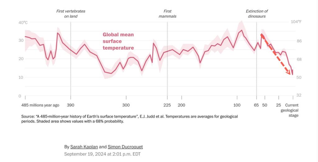
Besides the blatant bias in selecting the assumptions which serve the narrative there is another issue. Since the assumptions introduce uncertainty into the models it is of great importance how the models deal with uncertainty. The reason is that the models run an immense number of iterative calculations, each step depending on the output of the previous one. It is easy to see that errors might be propagated leading to a major issue with the reliability of the model projections.
In addition, the very complex models can deliver vastly different outputs starting with very small differences at the starting condition (butterfly effect from chaos theory). The climate scientists try to deal with the problem by using model ensembles. However, there are a couple of issues. When using the ensembles the climatologists want us to believe that the precision of the modelling process (how well the different models agree with each other) would tell us about its accuracy (how well it models reality). However, if the errors introduced by the wrong assumptions are systematic (not random) the ensemble will not help in any way to bring the models closer to reality. In addition, it is absolutely certain that the models do not perfectly mirror the reality of the processes of the Earth atmosphere. E. Thompson has discussed how only slight imperfections in the mathematical structure of the models will make the probability forecasts totally unreliable.
2. Testing the models
Thus, there are substantial reasons not to trust the modellers and their models. Fortunately, models can be tested to give us a better way to judge their trustworthiness.
The standard test of a model is comparing its output with real world data. This has been a challenge from the start since the models project so far into the future. A typical alternative approach to solve the issue has been hindcasting (model the past). The models (the assumptions) are adjusted until past temperatures are hind casted correctly. It is presumed that this represents a good test for their ability to forecast future temperatures. However, there is a major issue with that. Since the models do not agree about the climate sensitivity by a factor of up to three their correct hindcasting just means they have done the right adjustments of the variables for that purpose. It does not say anything about their capability to forecast. The chart of the Global Surface Air Temperatures demonstrates that: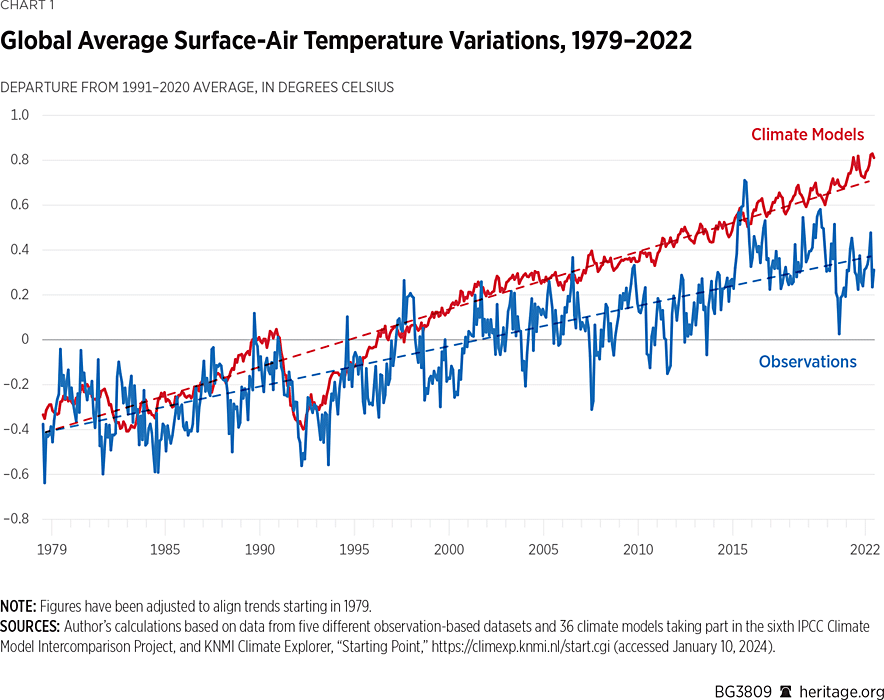
Adjusting the assumptions to reproduce the temperature up to 1995 (good fit) does not lead to an accurate forecast for the time after (no fit at all).
Thankfully, since we have seen forecasts from the models over the last 40 years, there are meanwhile quite a few data points which allow us to test their ability to forecast. However, it is important to remember in this context that the assumptions in the models are constantly updated to make them fit the latest measured values. This means that we have to look back at older models and their predictions to judge their validity. If we do that we find a rather disappointing performance.
In the first assessment report (FAR) 1990 we find: under the IPCC Business-as-Usual (Scenario A) emissions of greenhouse gases, a rate of increase of global mean temperature during the next century of about 0.3°C per decade (with an uncertainty range of 0.2°C to 0.5°C per decade)… This will result in a likely increase in global mean temperature of about 1°C above the present value by 2025…

What we experienced over the last 50 years is an average increase of about 0.18°C per decade.
This is a little more than half of the predicted warming. Taking just the time from 1990 the rate of increase might even be lower. (We will see later that the here mentioned measured temperature increases, in addition, are probably too high because of – again – biased assumptions.)
It seems the problem did not get better over time as even the IPCC could not help but admit:

Also in the FAR we find a predicted global mean sea level rise of about 6cm per decade over the next century … The predicted rise is about 20cm in global mean sea level by 2030.
What do the actual measurements tell us? The NASA measurements 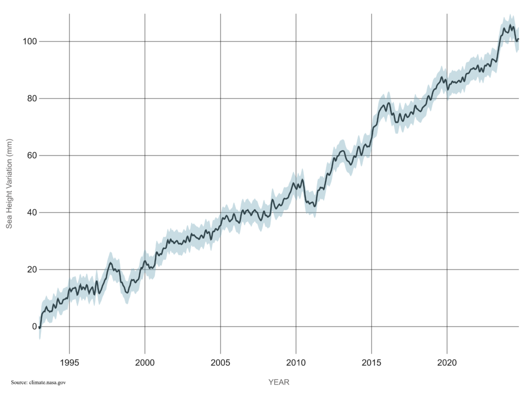 show between 1993 and 2023 a sea level rise of about 3.3 cm per decade. Again close to 50% lower than predicted.
We can conclude that the models around 1990 exaggerated the global warming and its effects by close to 100%.
Are the later ones are doing much better? The above cited quote from the AR6 says that probably not. This would not be surprising since they still try to prove CO2 the villain first of all.
Another chart supports the point and hints at another issue coming up in this discussion: 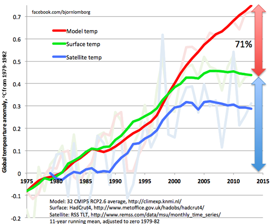 the differences between projection, land-based measurements and satellite data. Also this plot shows that the models run too hot.
3. Gaslighting to “prove” that the models are correct in their predictions
Of course, the alarmists will never accept such data without resistance. Too much is at stake for them. Here one example which just proves my point that their intent is not to tell us the truth but to support the narrative which guarantees further funds.
In their paper Hausfather et al argue that the model predictions agree well with the measured temperatures. They use a very neat trick to obfuscate the real problem with the temperature predictions and the alarm which is raised based on them.
It works this way: All the models run different emission scenarios (SSP) and show the related temperature predictions.
From these emission scenarios all IPCC summary reports as well as almost all public statements of climate scientists in the media refer to the predictions based on the 8.5 scenario (SSP 585 in the chart) which assumes very high CO2 emissions and they call it business as usual. All the alarmist predictions about heat waves, extreme weather, sea level rise etc. are connected to this scenario. All the trillions spent on preventing dangerous global warming are related to this scenario. And as has been shown (see examples above), the predictions based on this scenario are clearly running too hot.
Instead of acknowledging this and risk their funds Hausfather et al in their paper just replace the 8.5 scenario in the model calculations with one which assumes lower CO2 emissions and claim the this way adjusted results to be proof that the models are not running hot.
Thus, when raising the alarm in order to get more funds and power the model results based on the high emissions of the 8.5 scenario are used throughout by every alarmist “scientist”, bureaucrat and all the media. When people start to realize that the temperature predictions based on these high emission are running too high and start questioning the need for alarm the “scientists” just use lower emission data in the models and claim to prove this way the accuracy of the forecasts. The media headlines follow: The deniers lie, they manipulate the data, the models work well, trust the science.
It is hard to identify a better example of gaslighting in climate science.
4. Selection and manipulation of data
There are many more ways the alarmists try to make sure that the difference between predictions and measurements are not taken too much notice of. One of the main critics of the model predictions is Roy Spencer. He is the leading scientist working with the NASA Aqua satellite for temperature monitoring. As can be seen above his satellite (and balloon) data tend to show less warming than the earth surface measurements and clearly less than the 8.5 scenario based predictions. This, of course, calls the alarmists into action which need the warming to be as high as possible. They argue with the uncertainties of the satellite measurements (which, however, after further corrections still show less warming than the model predictions, see data) to claim that we must rely on the “much more reliable” surface data (which are closer to the model predictions). However, the issue with that is that the surface data are even much less reliable.
One major issue is that the surface stations themselves or their environment change over time. Stations are replaced, moved to a different place. The surface around the stations might be paved, new buildings are constructed, heat sources might come closer. Climatology deals with this by homogenizing the data. This does not mean that it checks the history of each station and corrects for observed changes. It does it by using a computer program called “Pairwise Homogenization Algorithm” (PHA). This essentially means they compare each station against its neighbouring ones and check whether its trend runs in parallel with the neighbours. If the algorithm finds a sudden change in one station compared to the others it takes this discontinuity (also called “breakpoint”) as a proof that something has changed at the station. The measured values at the “faulty” station are then adjusted. This homogenization process is run repeatedly, in some instances daily. However, it has been shown that the algorithm is very inconsistent in identifying breakpoints and those it identifies have mostly nothing to do with actual changes around a station. We can safely assume that also here climatology sets the variables in the algorithms in a way that supports its narrative.
We see this easily when looking at the corrections of past temperatures which these homogenizations generate. They overwhelmingly increase the warming rate. Here some examples (and links to a few more):
This chart shows the temperature data of the continental US before (orange) and after (blue) homogenization. Result: an increase in the warming trend as result of the homogenization.

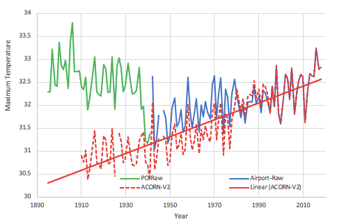
Mean maximum annual temperatures as measured at the Darwin Post Office and airport and after homogenization in the new official record for Australia. Again homogenization leads to a higher warming trend.
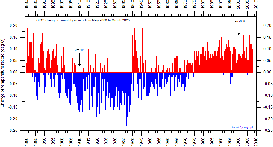
The homogenization of the global temperatures in the GISS (NASA Goddard Institute for Space Studies) diagram shows much mostly downwards corrections (blue) in the further past and more upwards (red) in the last 40 years. The result: a higher warming trend
De Bilt station – The Netherlands Source: Database GHCN-Monthly Version 2.
Homogenization leads to a much higher warming trend
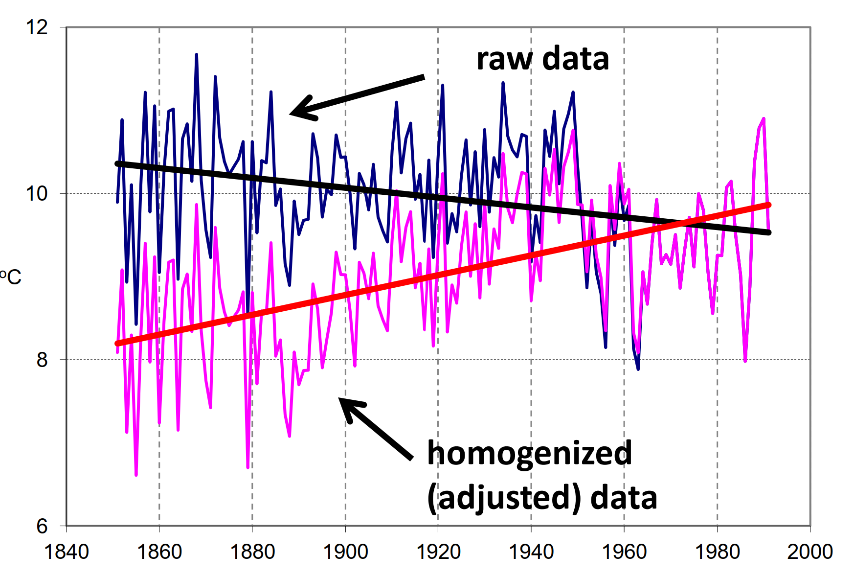
There are many additional examples showing the same bias. Just a few more here:
Alterations to the US temperature record, NOAA data tampering, Tobs at ithaca, Central Park Temperatures, Temperature data from 100 non-existent stations
A major additional challenge for the land-based data is the Urban Heat Island (UHI) effect.  It means that weather stations close to overbuilt areas measure higher temperatures because human activities create heat and because buildings and pavements heat up more and faster in sunlight.
The climate scientists claim that by homogenizing rural stations and urban stations they can remove the UHI effect from the temperature record. However, they again do calculations based on assumptions which help their narrative instead of looking at the real data of the stations. Accordingly, in their assumptions they (conveniently) miss a major factor connected to the positioning of the stations:
The rural stations are not at all free of urbanization effects. 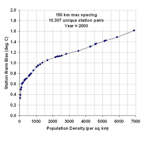 The opposite is true. The urbanization effect is highest at low population density. The addition of a few buildings to 20 already distributed over a certain area has a much larger relative effect that adding the same number to hundreds in an area of the same size in a city. The graph demonstrates this effect.
The fact that pristine weather stations in the US show a much lower warming trend than the NOAA (National Oceanic and Atmospheric Administration) homogenized values for the whole area clearly proves that the algorithm misses a major part of this UHI effect.
A further challenge to the adjustments via breakpoint identification is the ageing of the weather stations. It slowly increases the warming trend until the ageing is reversed by repainting or replacement (which represents a discontinuity and leads to a erroneous homogenization).
In addition, >80% of the earth surface had no stations until a short while ago and the rest was very inhomogeneously distributed. Furthermore, the coverage changed over time (e.g. after collapse of the Soviet Union). Facts, which allow the researchers to estimate/calculate the temperatures changes for major part of the surface for a major part of the time. Knowing about the strong drivers for the scientists to prove the CO2 theory correct we are on the safe side to assume that also here they select the estimations accordingly.
In summary, there are more than enough reasons not to trust the surface-based temperature records. They are clearly “homogenized” in a way which overestimates the warming trend. The lower values of the satellite measurements seem obviously closer to the reality. Which confirms that the models exaggerate the warming in order to support the narrative.
5. Are the models mainly mumbo jumbo to hide a simple truth?
It has been shown independently by at least two scientists that the output of the immensely complex climate models can be emulated by a simple equation. They demonstrated that the output is equal to the output of a linear equation connecting the temperature change to the change of the calculated forcing (Forcing = external influences on climate system. In other words, the models just connect the warming to the changes in CO2 – as the narrative demands).
Forcing stands for the influences on the energy balance of the earth:
 Incoming radiative energy from the sun – Outgoing radiative energy = Radiative forcing, calculated using the assumptions about influence of solar variations, greenhouse gases, reflections on aerosols etc.
Yellow: the output of the GISS model, blue: the output of the simple linear equation which connects the temperature change directly to the forcing change.

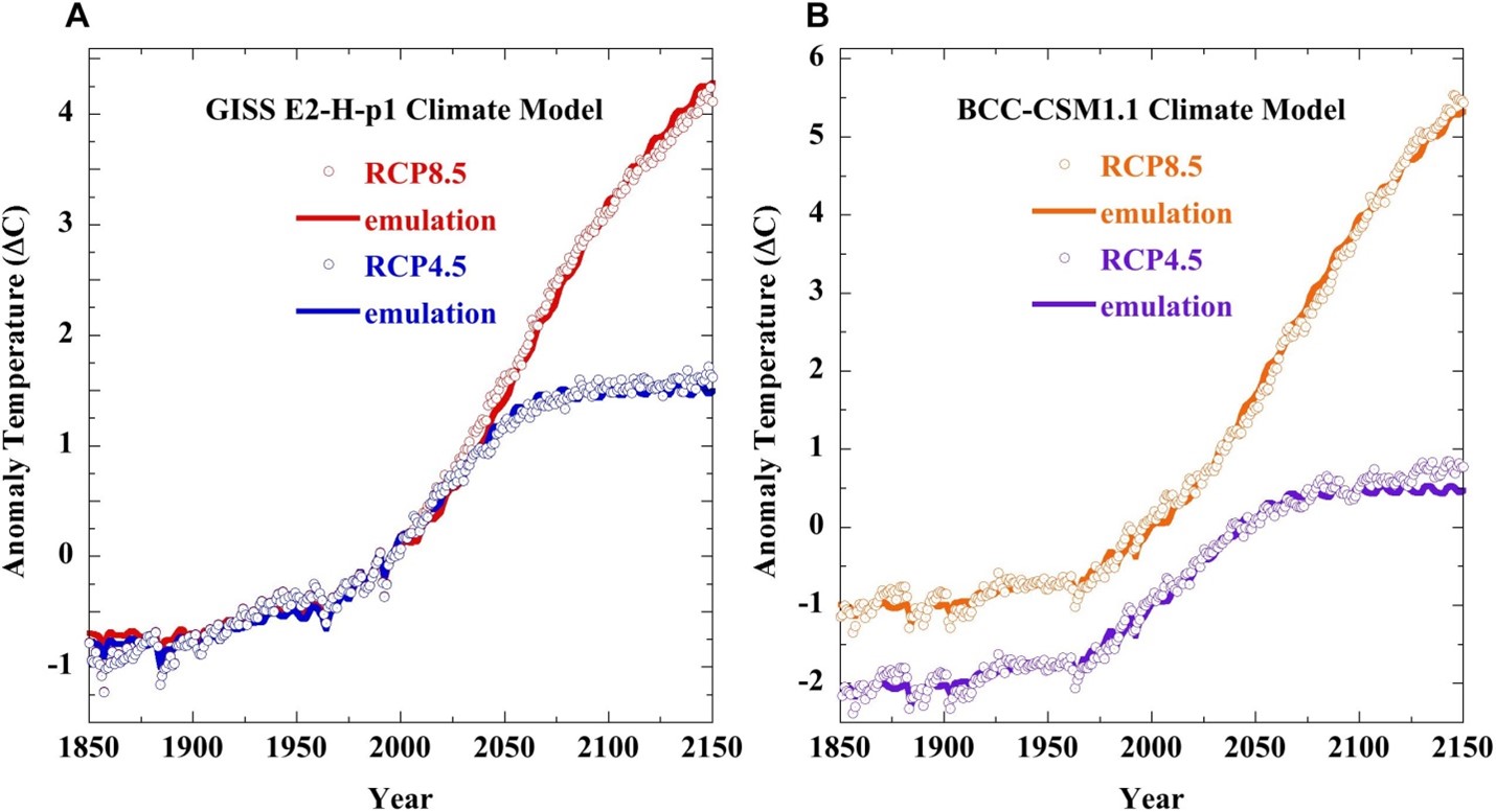
The full lines are the output of the GISS model and the circles represent the simple calculations linking the temperature changes to the forcing (CO2) changes.
Isn’t that the final proof of the pudding? All the billions spent on the models and all they produce are curves which simply connect the temperature to the calculated forcing, exactly as they must if they want to prove CO2 the villain.
Even further: Using this simple emulation of the overly complex models one author calculates a climate sensitivity (the increase in temperature when doubling the CO2 in the atmosphere) of 1.1, nowhere near the dramatic 3 – 4 the alarmists have been throwing at us over the last 40 years.
Summary
To summarize the discussion: Climatology has found two ways to assure the “right” results of their “research”.
- It suppresses data which do not conform by cancelling the scientists which come up with these results or just neglecting their results in the IPCC reports.
- For the many assumptions needed fill the holes in our understanding of the climate processes it selects the ones which lead to the desired outcome: CO2 is it and nothing else.
Is this kind of “science” able to give us the tools to objectively judge the effect of our lifestyles on the climate? Definitely not. It is closer to Voodoo than to what Popper requested from science.
However, there are obviously too powerful interests to keep the climate scare going. The unelected bureaucrats at the UN and the EU see their power grow immensely. The US government of J. Biden can spend trillions on its favourite subjects. Green NGOs see their influence and their money supply grow further. The media can keep their customers glued to the screen with an endless cycle of doom and Armageddon. And, last but not least, the trillions spent on “net zero” grant the big investors in “green” energies and in the reset of our societies a tremendous return on their investments.
At the end, a few people get MUCH richer from subsidies and corruption and the poor of the world can forget about their hoped-for path to a decent living by using cheap energy as we did. How long are we going to tolerate that?